
A project led by LSTM researcher, Dr Andy South, is developing open-source software to facilitate the use of health data in Africa. Recent work visualising the distribution of more than 100,000 African health facilities through a web application aims to support the response to the coronavirus pandemic.
Afrimapr is a one year project running in 2020, funded by the Wellcome Open Research Fund.
It is one of just 6 funded projects out of 93 applications to the fund last year. The afrimapr approach is to create software building-blocks in R, facilitating others to create data-driven tools and apps. By improving access to existing open datasets this will make it easier for others to develop digital solutions to local problems. The time is right given the rapid expansion of data-science communities in Africa.
The project’s initial core team includes members from LSTM; Talarify - a South African company developing research computational skills in Africa; the universities of Bath and Leeds and the Education Strategy centre in Ethiopia. The team has been joined by a collaborator from Senegal and is looking to grow.
The recent work on health facility locations is inspired by efforts in the US where an open data set of the location and bed numbers of all US hospitals has been made available (around 6.5k locations). These open data are already being used, for example in COVID Care Map, an open source project to support health system capacity.
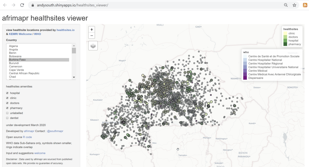
There are two main existing open datasets for health facility locations across African countries, one collated by KEMRI-Wellcome and now hosted by the WHO Global Malaria Program, the other from the global crowdsourcing project healthsites.io “an initiative to create an online map of every health facility in the world and make the details of each location easily accessible”. Anyone can contribute locations and attribute data to the latter. Afrimapr is in contact with both groups, making the data more visible helps all to improve data quality and coverage.
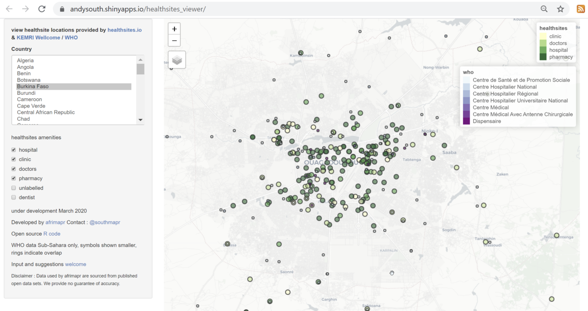
The afrimapr project is the first effort we are aware of to compare these two datasets. Using the viewer we can see e.g. for Burkina Faso that there appear to be many more sites from the WHO-KEMRI data (shown by the smaller blue-purple circles) than healthsites.io (shown by the larger yellow-green circles).
In contrast, zooming in on the capital, Ouagadougou, shows more records from healthsites.io.
The afrimapr team is just starting out with this investigation and welcome input, particularly on other potential data sources or how these tools could be improved.